Best B2B & B2C Website Designs (2023)
Web designs for any company, whether business-to-business (B2B) or business-to-consumer (B2C), need to be well thought out with specific goals in mind. Effective designs should not only clearly represent a company’s branding and offerings but also provide an easy, hassle-free experience for the user. In other words, a website must be easy to navigate, fast, straightforward, and mobile responsive while remaining true to a company’s mission and values.
In this blog post, we’ll highlight some of the best B2B and B2C website designs we’ve done and why they’re so effective.
WENZEL America
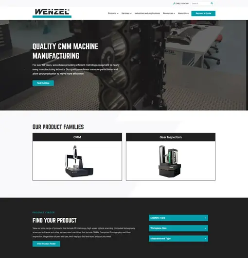
WENZEL America is a manufacturer of coordinate measuring machines. When you visit their website, you’ll immediately see what they do and the products they offer. The design is simple, uncluttered, and provides easy navigation options for the end users. Like WENZEL, your home page should be clean and visually draw website users to what you do.
Kiwanis Club of Utica-Shelby Township
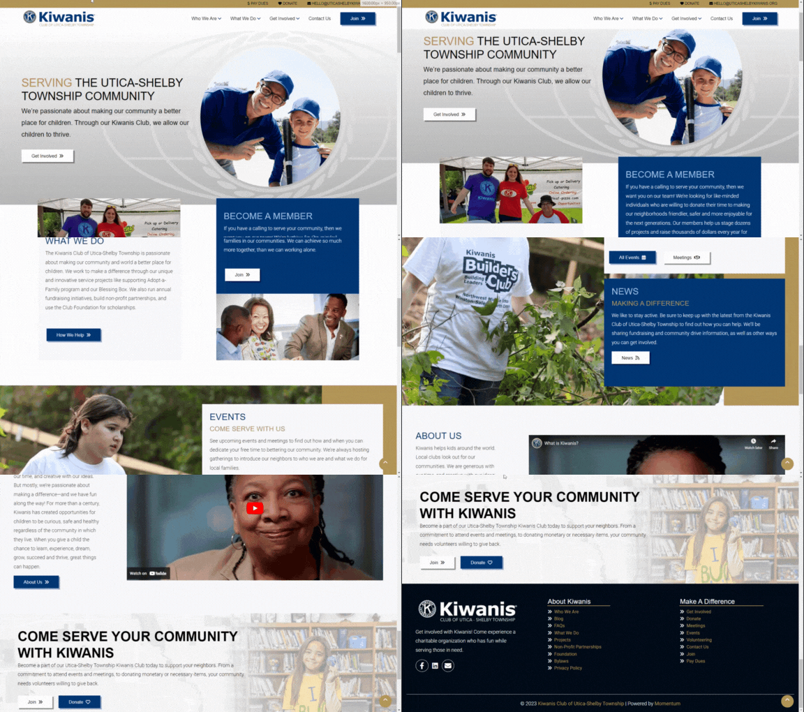
The Kiwanis Club of Utica-Shelby Township is a local service club that organizes programs and initiatives to improve the lives of children in the Shelby Township and Utica communities.
They had two primary goals regarding their website: growing membership and increasing donations. When we were approached to redesign their website, we knew we needed to create a site that would showcase the club’s amazing work and make it easy for people to get involved.
The new website features a prominently placed call to action (CTA) for new members, and upcoming events, news articles, and videos highlighting the club’s accomplishments. The site also includes clear links to make donations and learn more about the club’s programs and services.
BackWoods Rescue & Survival at Diamond Heart Wilderness Training Grounds
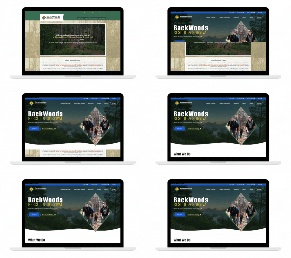
BackWoods Rescue & Survival hosts wilderness survival courses for first responders and the general public at their private, 55-acre Diamond Heart Wilderness Training Grounds.
The BackWoods Rescue & Survival team needed a website redesign that would establish them as a leader in their unique industry and make it easy for website visitors to learn about them and schedule a course.
The new website is a modern take that showcases crisp photography, large, bold text, and a clear hierarchy of information. Visitors can easily find information on course pricing, nearby lodging, and even get to know the instructors. The new website effectively builds trust with users and ensures new business opportunities for the company.
DuoCare Cleaning & Restoration
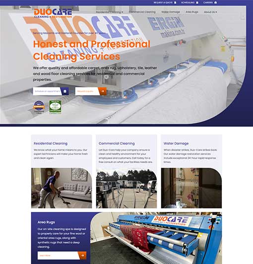
DuoCare has been serving Macomb and Oakland counties for over 40 years, and their commitment to providing high-quality service is evident on the website.
The home page features a video that showcases the company’s team hard at work, both at client homes and in their state-of-the-art cleaning and restoration facility. This video gives visitors a glimpse of the company’s expertise and professionalism and helps build trust with potential customers.
In addition to the video, the DuoCare website features several trust-builders, including the company’s guarantee, certifications, and client testimonials. These trust-builders help to reassure visitors that DuoCare is a reliable and trustworthy company.
King Steel Fasteners
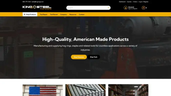
King Steel Fasteners is one example of how to design a website with the user in mind. The home page not only highlights what they do and the products that they offer but also provides plenty of CTA buttons for the user to click on, including “Shop Fasteners,” “Shop Tools,” and “Get More Information.”
Having multiple CTAs on your website can be incredibly helpful, as they tell the user exactly what they need to do. The user may leave your website if you don’t have these calls to action.
Signal.X Technologies LLC
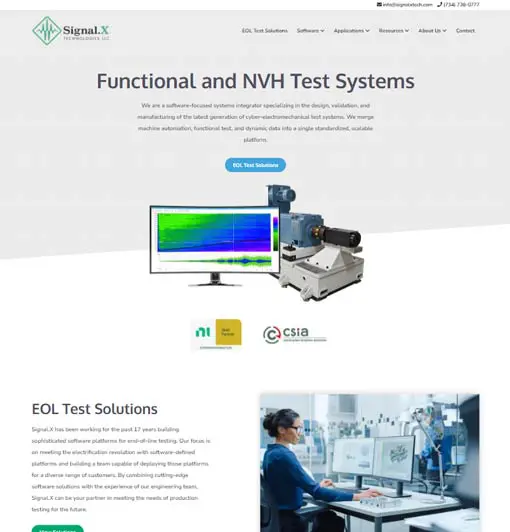
Signal.X Technologies is another example of a user-friendly website. Signal.X sells software and EOL test solutions to customers, but they recognized early on that their target audience wasn’t ready to make an immediate purchase—they wanted more information about their products.
This website design is effective because it gives the user plenty of opportunities to learn more about their solutions, including having call-to-action buttons with statements like “EOL Test Solutions” and “View Solutions.”
Barron Industries
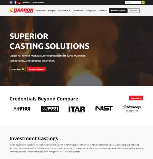
Establishing brand awareness and trust with your audience is essential if you’re just building an online presence. This is exactly what Barron Industries did with their website. Like other websites covered in this blog post, their home page states what they do and provides clear calls to action. However, they also include a credentials section on their page, which lists their certifications and memberships, case studies, and testimonials.
Mazlite Inc.
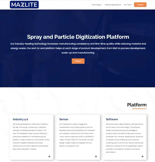
Lastly, if you’re an up-and-coming business, you’ll want to keep Mazlite’s website in mind. Mazlite was a startup looking to become a serious competitor in the market.
To achieve that, they needed to increase brand awareness and emphasize their offerings. Their website design is incredibly effective for a new business, particularly because of the above-the-fold content. This content clearly states what they offer and includes bold, noticeable buttons that invite website visitors to learn more about them and their platform.
Additionally, the design itself is simple and offers easy, straightforward navigation.
Create Your Industrial Website Design Today
So many valuable leads come from website visits. That’s why you need an effective website. But creating your first website is not easy—that’s why you need a web design agency like Momentum by your side. We’ve been designing and developing websites for over a decade, and our efforts have helped countless businesses grow their online presence.
If you have questions about the website design process or want to learn more about how we can help you, please contact us today to schedule a consultation.
